This looks very beautiful like a dream!
Categories
This looks very beautiful like a dream!
Why does this remind me of Melville’s Captain Ahab?
The crack became a slash

almost splitting her in two.

She could have sought help,

could have driven to heal it,

But after a while she quite liked it.

It had become part of her

and she felt it became her

and who knew what would emerge

to wriggle

and squeeze

though the gap.


*First published in The Drabble, May 2021*

About the Poet:
Lynn White lives in north Wales. Her work is influenced by issues of social justice and events, places and people she has known or imagined. She is especially interested in exploring the boundaries of dream, fantasy and reality. She was shortlisted in the Theatre Cloud ‘War Poetry for Today’ competition and has been nominated for a Pushcart Prize, Best of the Net and a Rhysling Award. Her poetry has appeared in many publications including: Apogee, Firewords, Capsule Stories, Light Journal…
View original post 10 more words
Like the perspective in “In Front of the House” which has a touch of Bloomsbury about it too.
In the first of these two articles looking at paintings using glue as the binder in the artist’s paint, I showed examples from the Renaissance, and from William Blake’s revival of the medium around 1800. During much of the nineteenth century, ‘glue tempera’ fell into disuse, with oils, watercolour and pastels proving far more popular until a group of young French artists started experimenting with different media.
 Pierre Bonnard (1867-1947), Stork and Four Frogs (c 1889), distemper on red-dyed cotton fabric in a three paneled screen, 159.5 x 163.5 cm, Private collection. The Athenaeum.
Among the first of these is Pierre Bonnard’s extraordinary and exquisite three-panelled Japoniste screen of The Stork and Four Frogs in about 1889, as the Nabis were forming. Using more modern pigments, Bonnard has achieved very high chroma, comparable to anything in oils, and quite unlike traditional glue tempera.
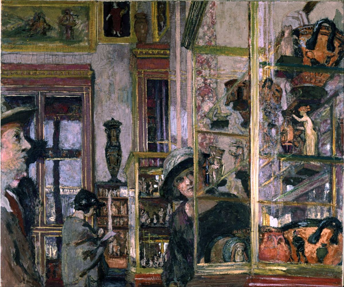
 Félix Vallotton (1865–1925), Misia at Her Dressing…
View original post 507 more words
A favourite and painted here in West Cornwall.
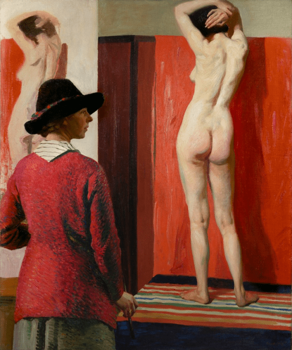
1. Laura Knight with model Ella Naper, 1913 / Oil on canvas / National Portrait Gallery, London, UK

2. Self portrait, 1921 / Oil on canvas / Museum of New Zealand, Te Papa
Great images and interesting background too.
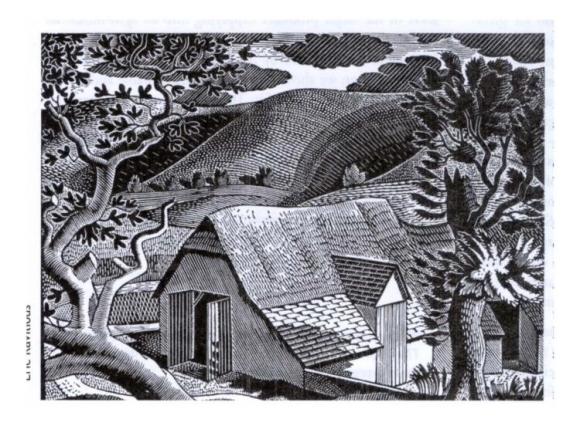
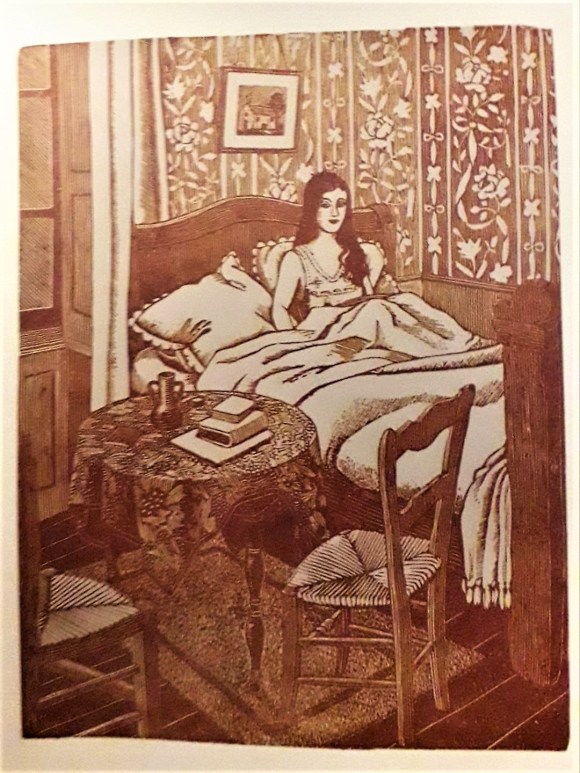
Wood Engravings: Eric Ravilious ‘Sussex Landscape.’ 1931. Tirzah Garwood ‘The Wife.’ 1929.
The term woodcut is often used to cover the woodcut proper and wood engraving which came much later, consequently a useful distinction is lost.
With woodcuts the design is drawn on a block and the parts which are white are cut out, cutting with the grain of the wood, leaving the surface in relief. The surface is then covered with ink and printed.
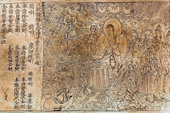
Wood-cuts are the oldest method of Relief Printing, the Chinese practised printing from wood long before moveable type was used in Europe. Just exactly when wood cuts were first used is not known but in the British Museum a Chinese manuscript bears a woodcut dated AD. 868, the earliest known illustration in a printed book. The illustration shows Buddha discoursing to Subhiti amongst a crowd of figures, all drawn in flowing black line.
Wood…
View original post 672 more words

Sounds wonderful if not quite what you expected.
Imogen is Reading and Watching the World: On Books, Film, Art & More
Translated by Andrew Brown
Claudine’s House was book 5 of my 20 books of summer. Published in 1922, it form part of my side project to read books from 1922 throughout 2022. Historically, 1922 was a momentous year. I recently read Nick Rennison’s 1922: Scenes from a Turbulent year, published this year, which gives a brilliant overview: this is the year the USSR was formed, the Ottoman Empire fell, the post-Spanish flu pandemic ‘roaring ’20s’ got under way and, in publishing, ‘peak modernism’ was reached. Books published in 1922 include both Ulysses (which I keep eyeing warily) and the Waste Land. And this engaging sort-of memoir by Colette.
Lots of people have pointed to the book’s charm, as it evokes Colette’s childhood summers in a French country house, replete with puppies and kittens and hair fastened with ribbons. Through a series of short vignettes, life with her fluttering…
View original post 255 more words

Lovely paintings these.
Several of the Nabis painted in pastels during their careers. Of the three I cover in this article, it was perhaps Ker-Xavier Roussel who was the most prolific in this medium, and created some of his finest works using it. All three benefitted from a relatively conventional training: Roussel, for instance, started as a pupil in the studio of Diogène Maillart, an academic history painter, and from there went on to the École des Beaux-Arts in Paris. All three were founding members of the Nabis when they were students at the Académie Julian under Tony Robert-Fleury.
 Ker-Xavier Roussel (1867–1944), Women and Children by a Village (Let the little children come to me) (c 1893-95), pastel on grey paper, 37 x 52 cm, Private collection. The Athenaeum.
Roussel’s Women and Children by a Village, also known by the Biblical quotation of Let the little children come to me, from about 1893-95…
View original post 577 more words
Very sweet!
Prandial Plaint

My love, I love your breasts, I love your nose.
I love your accent and I love your toes.
I am your slave. One word, and I obey.
But please don't slurp your morning brew that way.

Vikram Seth (1952 -
From The Times of India …
Vikram Seth is one if India’s most renowned writers. He’s known for his fiction and poetry and has been awarded with several honours in both Britain and India for his contirbution towards literature. He’s recieved a Padma Shri, a Sahitya Academy Award, a Pravasi Bharatiya Samman, an Order of the British Empire(Officer) and several other prizes for individual works.
His poetry is known for it’s witty wordplay, it’s rhythm and rhyme scheme. With simple words and thoughtful phrasing he evokes rich imagery, and there’s always a clever message clear towards the end.
And this is clearly evident in the above poem!
View original post 48 more words
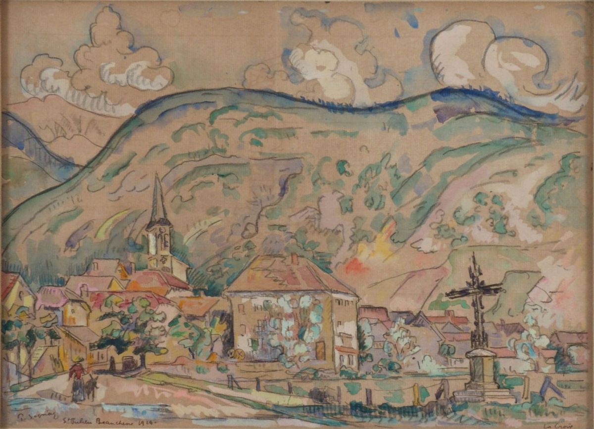
These are really lovely- magical in fact.
Over the last three months, I’ve shown many of the oil paintings of Paul Signac (1863-1935), but have omitted his watercolours. During his early career, he seems to have used these primarily as preparatory sketches made in front of his motif, then recomposed and adjusted them to form the basis of his studio oil paintings. Given the painstakingly slow pointillist technique, it’s hardly surprising that he found this preferable to alternatives such as oil sketching.
In time, he was persuaded to exhibit these sketches, and by the twentieth century they came to form a substantial part of his art that was seen by the public. In this and the next couple of articles I show a small selection from these. Sadly, most of his watercolours from before 1918 are no longer accessible, but here are a few from that period that reveal Signac’s other art, completely different from his oil…
View original post 542 more words
