Categories
Tag: architecture
What an amazing place! 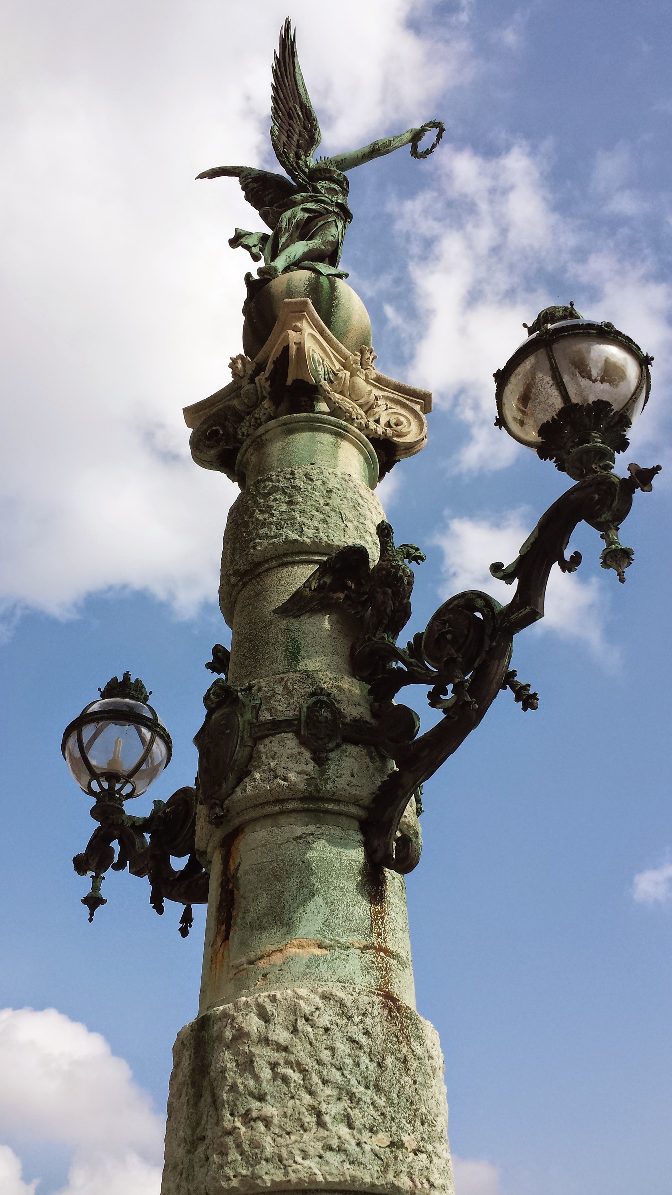 Recovering from the cost of a taxi from the airort I was amazed at the amount of industry-the light colour and the cleanliness of the scene into Vienna. Travelling around the city was veryeasy with U-bahn and strassenbahn and bus. The U-bahn gehen ueber, nichts unter. Most impressive are the massive wooden doors that form the entry to the U-bahn and most other large buildings.
After a brief wander around and past the Natural History Museum, I came across a lovely rising winding street and smaller gasse.  I discovered what looked like a bohemian student bar -Kafka’s Bar.
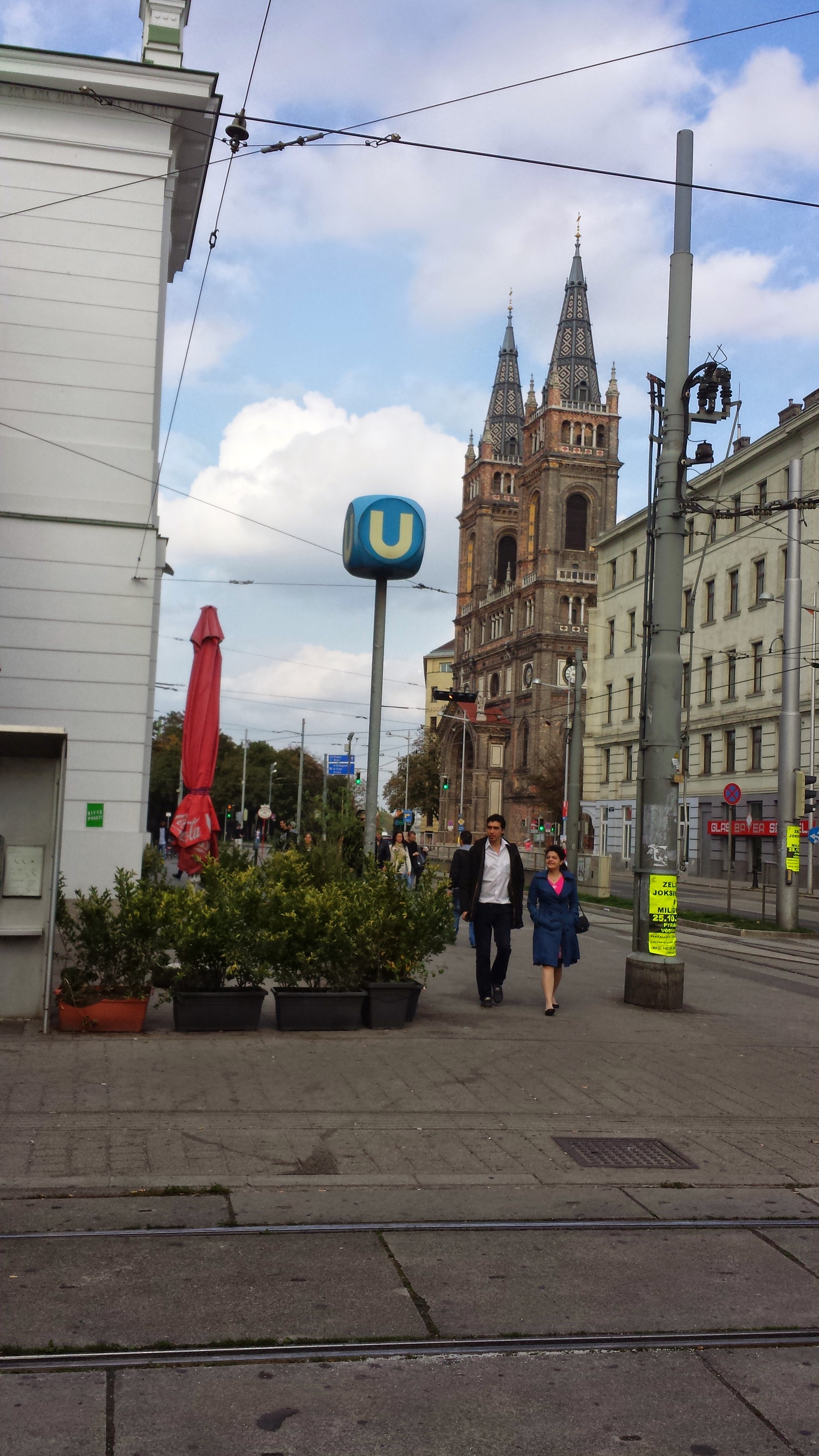 The Linselsuppe here was much the best value that I have discovered here on the first day. Then around another few corners opposite the Meerhaus, a lovely cafe-bar opposite in the late afternoon sunshine. Cappucino and crepes with honey and bananas and I felt I had already found my indulgent Vienna. A few steps later the social conditions, the dachtlos, influx of migrants from the East and people sleeping in doorways around the church showed another side of life here.
“In 1960 Ida Kar (1908-74) became the first photographer to have a retrospective exhibition at a major London art gallery. Her portraits offer a fascinating insight into post-war cultural life and her subjects included some of the most celebrated figures from the art world of 1950s and 1960s Europe and Russia. A number of the artists Kar photographed also included artists from the St Ives School.” as it says at http://www.royalcornwallmuseum.org.uk/exhibitions/.
I saw this exhibition on Saturday and was truly moved at this small but fascinating exhibition and the sculptures that came with it which included Hepworth and Epstein. Lovely picture of Ida with Victor Musgrave with whom she lived in the 1940s in Cairo. Delightfully bohemian, her work is taken from the studios and ateliers of Paris and London. Even more exciting I found her photographs of St Ives in the 1950s. Her Braque portrait captures the essence of the artist-his eye sockets look as though they were a Picasso portrait brought to life. The portraits of Leach, Denis Mitchell whose reputation is still growing and Hepworth forming an armature from wire for a sculpture are all lively and moving. The original exhibition at the National Portrait Gallery is reviewed at http://www.theguardian.com/artanddesign/2011/mar/13/ida-kar-bohemian-photographer-review. There is a great review of her photographs at http://www.bbc.co.uk/news/entertainment-arts-11998337. Should you get to Truro Museum at the moment there is an intriguing collection, A Century of St Ives Art 1840-1940.


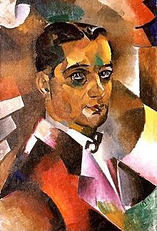
This portrait by Vladimir Baranoff-Rossine (1888–1944) was completed in St Petersburg and it shows a cubist influence, the dynamism associated with futurism as well as a colourful lyricism. The palette is already not dissimilar from Sonia Delaunay with whom he was later to co-operate in Paris in the development of Orphism. They were both Jewish emigrants from Ukraine anduntil 1914 he was a resident in the artist’s colony La Ruche. This was an old three-storey circular structure- hence its name which is French for ‘ The Beehive’- situated in the 15th Arrondissement on the Left Bank and originally designed by Gustave Eiffell as a temporary building in the decidedly colourful area called the Passage Dantzig.
According to the Oxford Art On-Line, “His proximity in the mid-1900s to the artists of the nascent avant-garde, especially David Burlyuk and Vladimir Burlyuk, was of decisive importance to his stylistic development. Contributing to The Link (Kiev, 1908) and their other exhibitions in Moscow, Kiev and St Petersburg, he supported their stand against Realism and the Academy, favouring a brightly coloured post-Impressionism reminiscent of Georges Seurat and Louis Valtat.”
Amongst those considered as key figures in the development of painting before Matisse is the painter and print maker, Louis Valtat. He was a close friend of the Nabis. The latter used simple areas of pure colour and along with Gaugin, these influenced Valtat towards the purity of form, line and colour known as synthetism. His later work is also considered by some, notably Natalie Henderson Lee as proto-Fauvist. This was no doubt due to the time he later spent near the Mediterranean which intensified his use of colour.
Because Vladimir Baranoff-Rossine was fond of a bright coloured palatte it was said that he was influenced by the post-impressionism of both Seurat and Valtat. It is interesting how much information seems to have been flowing between Paris and St Petersburg in the mid 1900s partly due to the influence of art magazines. It was also supported by the influence of the members of the group The Link (Zveno) the Burliuks organized an avant-garde exhibition in Kiev.

Rossine’s self portrait was painted when he was just nineteen. The work already shows his movement towards a orphic style although his palette is not that far away from the colours employed by Nathan Altman in his The Ziger Macher (the watch mender). The notes from Hammersite.com suggest that this particular portrait was painted about 1914 and go on to say,” The painting is from the period Altman exhibited with The Jack of Diamonds group and attempted to express Jewish national identity utilizing a contemporary style. “
When Rossine moved to Paris in 1910, he will have come into a situation where critics such as Apollinaire, Gleizes and Vauxcelles were developing and defining the Cubist project. In addition he was already associated with the rather more expressionist style from the Russian cities such as the Burluik brothers. It must have been a period of quite frenzied excitement leading to the many innovative works.The crescendo came in Paris by 1913. (See The Essay at http://www.bbc.co.uk/programmes/b01pt70h) Other interesting figures within this general ambit include Jean Metzinger, František Kupka, a Czech painter, David Sheterenberg and the Ukrainian Avant-Garde Sculptor, Alexander Archipenko. The latter possibly an influence on Rossine’s own sculptural work.
More Rossine paintings can be viewed at http://www.flickriver.com/photos/tags/Rossine/interesting/
1925
 The eye-catching, penetrating splendour of Matti Braun’s lyrical paintings and creations are as unusual asthey are inspiring. Braun was born in 1968, trained at the State Academy of Fine Arts in Berlin and also in Frankfurt, he works in Cologne and has had several major exhibitions in Germany, France and Italy. His work can be seen currently at the Arnolfini Gallery in Bristol until the 6th Jan 2013. Further details may be found here at http://www.madeingermanyzwei.de/Kuenstler/Matti-Braun This current exhibition consists of an installation constructed from sections through a Douglas Fir tree obtained from Westonbirt Arboretum. These are surrounded by a lake of water creating a placid, contemplative effect. Filling the tank in which they are enclosed, gave the Bristol fire brigade a useful opportunity for them to practise and develop their skills. Further information can be read on http://www.arnolfini.org.uk/whatson/exhibitions/details/1409 and photographs of the operation at http://www.bbc.co.uk/news/uk-england-bristol-19862898 and http://www.bbc.co.uk/news/uk-england-bristol-19747232 The work was apparently inspired by a film, later abandoned, by the renowned Bengali filmmaker Satyajit Ray. It was entitled ‘The Alien’.

Braun’s oeuvre includes photographs, installations, sculptures as well as paintings. Some of the latter were displayed in a large exhibition in Rome in 2011 and can be discerned in a You Tube movie at http://www.youtube.com/watch?v=cTmTE-SHD60 and there is a book by Friedemann Malsch et al available on Amazon at http://www.amazon.co.uk/Matti-Braun-Kola-Friedemann-Malsch/dp/3865605966/ref=sr_1_2?s=books&ie=UTF8&qid=1351434791&sr=1-2
In some respects Braun’s compositions are a little reminiscent of the rainbow effects in the colour field paintings of Morris Louis- which the critic Clement Greenberg has termed post-painterly abstraction. There is also the possible influence of Mark Rothko. His paintings in acrylic, silk and cold-rolled steel bring to mind the evocative inks of a Rorschach test. Certainly, they invite the viewer’s personal response or interpretation.

Braun is gifted and prolific. His thought provoking and exciting conceptions will repay further attention in forthcoming years. On a personal basis they remind me of a garden hedge clustered in Mesembryanthemums in full sunlight. Set against a dark background they might suggest the delicate fronds of various luminescent underwater sea coral.

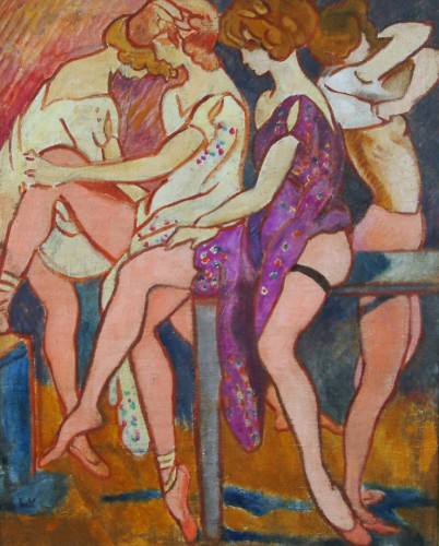
Popular in the interwar period, if not before, the tea dance must have been a gentle affair that offered an opportunity to relax with friends and with the possibility of meeting new partners. The recreational space around an outdoor bandstand had afforded a similar opportunity in the Edwardian era. This is discussed in People’s Parks by Hazel Conway and in a review by Susan Hill in the LRB she commented, ” At the same time, forms of design and architecture peculiar to the parks grew up – bandstands, pagodas and winter gardens, floral clocks and tea houses were the popular art of the parks.” There is a website that specialises in images of bandstands at http://www.satiche.org.uk/bandstands/bs-uk.htm
 Tea Dancing c 1920")

The indoor space of the tea dance was more intimate than the park and it is interesting to note that the spectacle apparently evolved from the French colonisation of Morocco, hence the correct term, thé dansant.. Morocco became a protectorate of France in 1912 after the Agadir crisis. In any event the tea dance had reached England by 1880 and appears to have become popular in the suburbs rather than London, in garrison towns and no doubt was popular amongst with the ascendancy of the Raj as well. Tea dances frequently followed upon afternoon summer garden parties. More details are to be found on http://www.teamuse.com/article_010702.html in an article by Jane Pettigrew.

Tea dances must have become more popular in the Jazz era and dances like the Tango and the Charleston would have added extra fun; the invention of the gramophone although records could easily be scratched might have added variety if a dance band was not available or affordable. It also seems that as well as the event itself, tea dance dresses too have once again become popular.
")
There is a very entertaining and informative website at http://bjws.blogspot.co.uk/search/label/Teawhich has paintings by the Peruvian artist, Albert Lynch 1851-1912 and the English Artist Mabel Frances Laying, 1881-1937. In addition there are some beautiful teapots and details of eighteenth century coffee houses and the splendid Baltimore Tea Gardens. For some recent interpretations try:-https://www.youtube.com/watch?v=GpwbyggIFuo
 Young Woman in Straw Hat")


There has been a renewed interest in works of British Surrealism in recent years. In summing up an exhibition in The Independent on the 26th May 2008 at The Middlesborough Institute of Modern Art- http://www.independent.co.uk/arts-entertainment/art/features/british-surrealists-minor-league-but-major-players-834236.html -Tom Lubbock wrote,” People have said that Britain was Surrealism’s original native land Alice’s Adventures in Wonderland, William Blake, the gothic novel, Gulliver’s Travels etc. Perhaps we didn’t need the whole movement-and-manifesto thing. But it produced, slightly by accident, a group of very interesting pictures that ought to have a wider showing, and which the Sherwin Collection is willing to lend.” Clearly symbolism and surrealism have obvious links in mythology and archetypes and such matters were thrown into the generally creative and tempestuous furore which grasped interest in the period between the wars.This climaxed in in the organisation of the International Surrealist Exhibition in London in 1936. There is some evidence of these issues in the paintings displayed in the current exhibition, mostly on loan in Falmouth from the Southampton Gallery. The artists on show include PAUL NASH,CECIL COLLINS, CERI RICHARDS, ROLAND PENROSE, JOHN TUNNARD, EILEEN AGAR &ITHELL COLQHOUN.
Some idea of the range of the Exhibition may be gained from the images to be found at this website, http://www.thisiscornwall.co.uk/pictures/Photos-British-Surrealists-Falmouth-Art-Gallery/pictures-16910494-detail/pictures.html

However, the most exuberant and baroque piece was a comparatively recent work by David Kemp – entitled “The Hanging Gardens of Basildon”. On his blog, Kemp comments, “It is one of a series of a dozen large plant forms, all influenced by “THE GARDEN OF EARTHLY DELIGHTS” an enigmatic painting by the great Hieronymus Bosch, which explored many aspects of medieval life, many of which might still be seen as relevant to the human condition, in our modern world?” This comment on the fantastic botanical forms and the connection with Bosch is reminiscent of the work of the VienneseSchool of Fantastic Realism as explified by Arik Brauer whose interest in Bosch he derived from his own tutor, Albert Paris von Gütersloh.

No visitor can possibly fail to be impressed by the peculiar botanical drawing, named “Prophylactic sea-mouth” by Edith Rimmington. The haunting form appears as some kind of elongated mutation of a dogfish egg-case with a coiling eel like flagellum.

However, for those interested in the development of the work of Paul Nash, his oil painting, “The Archer” will doubtless attract attention both for its muted complementary colours and the charmingly odd bucolic setting. A friend comments in a personal communication, “The Nash is one of his complex compositions worked on for years with bits from all over the place. There is a letter by Nash about it in Tate Archives. The central ‘archer’ feature was a structure he made from an old toy boat, glass tube, twig, seaweed etc. I don’t think it exists anymore other than as a photo. It looks more compelling in the photo with strong echoes of surrealist sculptures by Giacometti, Man Ray etc. He constructed (like Lanyon), collected and photographed sculptural objects from which he derived elements of his paintings.
 Tate; Supplied by The Public Catalogue Foundation")
The ‘target’ is from Men-An-Tol of course + mirrors etc; the shadow of the girl bottom right, sampled from De Chirico etc.etc. All very sexual with the ineffective arrow being merely the shadow of the archer….. I’m not convinced that he managed to get it to cohere as an image. I wish he had left the landscape dominant as with ‘Landscape at Iden’ http://www.tate.org.uk/art/artworks/nash-landscape-at-iden-n05047 where the symbolic elements infuse the composition naturally.”
Those interested in Roland Penrose’s work can consult http://www.rolandpenrose.co.uk/works.aspx

This photograph of de Kooning and his wife, Elaine is engaging in its own right and may be found on a very useful and visually appealing website, at http://artistandstudio.tumblr.com/archive a site which includes self-portraits, painters and their models, their ateliers in pictures and photographs. Looking at this handsome couple prompts further work into abstract impressionism, its history and associated figures. The photograph is particularly engaging and was taken by Ibram Lassaw.


Willem de Kooning(April 24, 1904 – March 19, 1997) was born in Rotterdam in the Netherlands and journeyed to New York at the age of twenty, he was a stowaway and was very taken by Jazz. He came to prominence when he painted the 105 public murals for the 1939 New York World’s Fair. As the Wikapedia article about him states,” As his work progressed, the heightened colors and elegant lines of the abstractions began to creep into the more figurative works, and the coincidence of figures and abstractions continued well into the 1940s”. At http://www.theartstory.org/artist-de-kooning-elaine.htm it states of the couple,” Elaine and Willem de Kooning endured a long and, at times, very tumultuous marriage. As much as each artist benefited from one another’s paintings and teachings, they mutually suffered due to constant infidelities and struggles with alcoholism.”
")
") Of particular interest is the abstract expressionism developed by de Kooning’s erstwhile colleague, whose fascinating work can be viewed at http://www.tumblr.com/tagged/adolph-gottlieb?before=1338654139 Gottlieb joined de Kooning and others, including Mark Rothko from 1935 to 1940 in a group known as “The Ten” http://www.louisschanker.info/tendisc.htm. Some of Gottlieb’s ouevre is somewhat reminiscent of Paul Klee.
Of particular interest is the abstract expressionism developed by de Kooning’s erstwhile colleague, whose fascinating work can be viewed at http://www.tumblr.com/tagged/adolph-gottlieb?before=1338654139 Gottlieb joined de Kooning and others, including Mark Rothko from 1935 to 1940 in a group known as “The Ten” http://www.louisschanker.info/tendisc.htm. Some of Gottlieb’s ouevre is somewhat reminiscent of Paul Klee.


")
-

Gravity

In the dolorous, beautiful and heart-rending poem “The Rape of Lucrece”, Shakespeare writes these wonderful lines:-
To see sad sights moves more than to hear them told,
For then the eye interprets to the ear
The heavy motion that it doth behold,
When every part a part of woe doth bear.
‘Tis but a part of sorrow that we hear:
Deep sounds make lesser noise than shallow fords,
And sorrow ebbs being blown with wind of words.
The poem may be found on the Literature Network at http://www.online-literature.com/shakespeare/331/
The work will be presented at the Edinburgh Festival this year and details may be found at http://www.eif.co.uk/rapeoflucrece

The first painting, considered here, ofLucretia is that by Joos van Cleve, a Flemish artist dated 1525 (Oil on panel). The Rijksmuseum says,”Joos van Cleve was probably born in the town or province Kleve in Germany. He trained under a painter in Kalkar. Probably, he started working in Bruges in 1507. Later he moved to Antwerp, where he registered as a master painter in the painters guild. Van Cleve was one of the most influential painters in Antwerp. He received major commissions for portraits and altarpieces. In his paintings he combines a traditional approach with new elements. He was one of the first to paint broad landscapes in the background. In the north, painters began to show an interest in landscapes in the sixteenth century.” It is said that, that like Quentin Massys, a fellow artist of Antwerp, Joos van Cleve appropriated themes and techniques of Leonardo da Vinci.

Having recently seen Massys’s beautiful painting of Flora, 1559 in the Kunsthalle in Hamburg, I can vouch for its entrancing effect which has spurred me to look too at his splendid and interesting oeuvre.
This may be further explored at http://www.artcyclopedia.com/artists/massys_jan.html

There are 9 images for The Rape of Lucrece in the Lessing Archive http://www.lessing-photo.com/search.asp?a=1&kc=202020203B61&kw=RAPE+OF+LUCRETIA&p=1&ipp=6 of which that of Joos van Cleve, in my view, is the most moving. This is due partly to the intense use of colour and partly because of the composition. Her head is slightly raised and there is a plaintive and doleful expression on the face which clearly evokes her immeasurable sense of violation. The gesture is expressive rather than realistic and conveys the sense of drama, emphasised in the picture by the diagonal composition. The swirling dishabille of her dress and attendant necklace, the lacing, the elegant sleeving and in particular the looping arc about her headdress adds to the emotional sense of dire confusion. Her royalty is conveyed by these fine robes. The red and black surrounding the more delicate flesh tones add to the sense of catastrophe. Such emphatic use of colour reminded me of Munch’s painting of The Madonna with which it is interesting to compare and contrast, since this second painting with its languorous quality is quite different in terms of the feelings communicated. http://www.edvard-munch.com/gallery/women/madonna.htm
")
The second picture is by the renowned British print maker, Stanley William Hayter, whose magnificent work has appeared fairly recently at the Annex Galleries, http://www.myspace.com/annexgalleries/blog/433291678.Hayter, it is mentioned was, “A chemist by training, Stanley W. Hayter spent most of his life in Paris. He is often noted for his 1927 founding an experimental workshop for the graphic arts – Atelier 17-that played a central role in the 20th century revival of the print as an independent art form”. His knowledge of chemistry was obviously a great asset in his printmaking and a brief biography may be viewed at http://www.wolman-prints.com/pages/artistbiog/all/h/293.html His etching from 1934 appears to be in MOMA and further detail can be obtained from http://www.moma.org/collection/browse_results.php?criteria=O%3AAD%3AE%3A2558&page_number=3&template_id=1&sort_order=1

The etching and engraving which in a twisted and troubled composition in black and tones of grey, dramatically suggests the violence of the rape itself in convoluted tubes with a sharp diagonal point, perhaps suggestive of Tarquin’s arm but surely demonstrates the violence of the crime itself. The lower figure seems distraught and crudely exposed to the upper figure which appears too as some sort of metamorphosised fly with the same stabbing structure seeming like some horrific proboscis. Also Armion according to Wikipedia remarks upon,” The association between the phallus and the blade later becomes quite clear when Tarquin enters Lucrece’s chamber and threatens the young woman with his sword”. Here the abstract forms fully express the extremity of the situation. At this time, it appears Hayter had just moved to No. 17, Rue Campagne-Première and was, a few years later to collaborate with Miro, Kandinsky and Picasso on artwork for the Republican cause in Spain. Perhaps this is reminiscent of the significant political result of these events, that Lucius Junius Brutus, nephew of the last Tarquin King led the rebellion against him and founded theRomanRepublic.
Hayter was influenced by the Polish printmaker Józef Hecht, who introduced him to copper engraving. Hecht’s own prints and paintings are both interesting and highly engaging. http://mushecht.haifa.ac.il/art/GhezCollection_eng.aspx?id=8

Noisy Street
oil on canvas, 80×100 cm.

This is now playing in the Edinburgh Festival 2012, should be really interesting:-http://www.guardian.co.uk/music/2012/aug/13/camille-o-sullivan-rape-lucrece

At the end of May I had the opportunity to meet Maggie at her lovely granite cottage just off the coast road from Land’s End to St Just where I interviewed her about her development as a painter and printmaker. She has recently bought herself a new etching press which was on the table where we sat and had coffee around the sturdy wooden table. Her next exhibition will commence at the Cornwall Contemporary (http://www.cornwallcontemporary.com/ ) on the 17th August and runs to the 10th September.

Maggie grew up in Brynmawr in Gwent, South Wales and first came to Cornwalljust after leaving Exeter College of Art and Design. (Further details may be found at http://www.maggiematthews.co.uk/). Graham Sutherland was an early interest, particularly his use of colour. Having already been inspired by the landscape of South Wales with its magnificent mountain scenery, she was further impressed by the fabulous light of Penwith. Her family had strong naval connections, her grandfather had in fact been bombed out of Devonport, and the sea itself was an additional attraction for which she felt a strong, familiar affinity. Her palette changed completely and she became deeply interested in the St Ives painters. She was now to paint in bright and vivid colours which she soon came to use and to love.
Porthcawl andBarryIsland, nearCardiff, during the Miners fortnight holiday had already started a love of the beach and its natural history.ComprehensiveSchoolhad encouraged her interest in art, ceramics and sculpture but in addition Maggie enjoyed biology and maths, interests which were to prove an inspiration as her work has developed.

The facilities at Exeter, near the river inspired her interests in printmaking and ceramics. The geological society had an outward-bound bus and so there at weekends came down to Cornwalland whilst other students examined the rocks in CotValleyand other places, Maggie would be enthusiastically sketching. The sea, the mining and the Celtic connections were an additional attraction. After a period working on the manufacture of air and oil filters in industry in South Wales, Maggie arrived at Penzancejob centre whilst on a two-week holiday. She got a post working on the Jetsetter computer graphics project drawing paired-down sketches of simple objects like wine glasses and pencils.
Maggie continued to sketch the landscape intensively at weekends. She also went on Friday nights in St Just with Mary Stork to draw life studies, which she found a useful exercise and with Mary’s support she exhibited her work for the very first time.

Her first solo show was in Brown’s Restaurant which Maggie then proceeded to show at for another two more years and then had a further displays at Avalon in Marazion. Her very abstract colourist compositions at this point were very much influenced by her attraction to Patrick Heron’s work. In particular Maggie likes his later garden works and the space and depth created in these compositions. Paul Nash, Samuel Palmer, William Blake and Sutherland remain her favourite works for their pastoral, lyrical qualities. She remains interested in printing, ceramics and expresses an interest too in sculpture.
